Design, reverse engineer

Tasty Yet Deadly

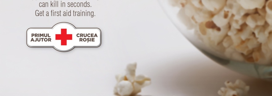
This advertisement for the Red Cross, to help people realize the importance of educating themselves with the knowledge of what to do in the case of someone choking, was created through the Lowe & Partners, Bucharest, Romania advertising agency which later merged with the Mullen Will agency. Multiple people were involved with its creation.

Manuela Gogu who is the creative director who worked on the creation of this advertisement.  She is a creative genius who has been with the company for nine years now.  She has been able to spend time refining her “multidisciplinary vision in creative & strategic think tanks in Berlin, Belgrade, Cannes and London.”  She is a visionary individual with a keen perspective and filled with many ideas. Gogu has “been engine in many of the creative platforms developed in our group of companies: from PR to ATL, from brand to corporate communications, from BTL to digital and social media campaigns.”  There have been 40 awards won at both local and international communication festivals due to her contributions.

Dan Costea is the art director who aided in the creation of the advertisement. He obtained his education at Romanian – American University in Economy of National and International Tourism. Costea has worked has worked for Geometry Global Bucharest and Mullen Lowe Bucharest as the Senior Art DirectorTempo Advertising as the Art Director and Gavrila & Asociatii as a Jr. Art Director. His he is skilled in utilizing Adobe IllustratorBrand IdentityLogo DesignPhoto ManipulationPhotoshop and has received multiple awards for his work.

Florin Iorgulescu is an experienced photographer who created the photograph for this Red Cross advertisement.

Due to my experience, this advertisement is legit.  I have enjoyed eating popcorn smothered in butter with just the right amount of salt on it. I have also had to perform the Heimlich maneuver on my nephew due to his overriding desire to eat popcorn which left both of us and his mother shaky yet grateful that I had the knowledge to save his life.

Links:

TypeFace 1 Category 

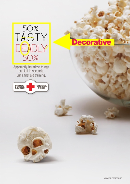
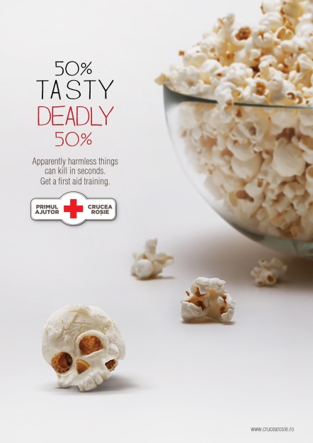
This team of individuals chose to utilize a Decorative typeface for the title of this advertisement. I know the typeface is in the decorative category due to the fun ease that is within the text. For instance, the E’s top arm extends further than the lower two arms and the A has an unusually thinner than the other letters utilized within the title.  The lines within the typeface are not smooth as they would be in the other categories.

TypeFace 2 Category 

The main body of the advertisement’s typeface falls into the Sans Serif category. I was able to determine this due to the lack of serifs and the lack of stress (think and thin lines) within each letter. Thus, the typeface is of monoweight which is also an indication of the Sans Serif category.

Contrast Between the Typefaces

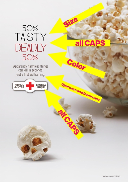
Contrast played a key role in this advertisement. The first indication is in the color variation within the Decorative typeface in the title. They used black to indicate the good part of popcorn and then the color of red to show the deadly side of it. You can also see this variation of color with the body of Sans Serif text, color gray, and the logo text, color bold black. You then can find contrast in the size differential between the two typefaces; the Decorative typeface is set in a larger format than the Sans Serif. Finally, notice how the title is written in all caps while the body utilizes both upper and lowercase letters, that is until the logo comes into play then it too converts to all caps to show it’s importance.

Conclusion

Even though the typography in this advertisement follows the softer lines of the center alignment you can still fill its strength through the use of color, caps and size. Through the use of these contrast, you can literally see the danger with eating popcorn; especially when you see the red typeface, Deadly, indicating danger which correlates with the piece of popcorn shaped into a skull. You can also see the enjoyment that comes from eating the finger-lickin’-good popcorn in the fun typeface of the title. The Low & Partners worked in perfect unison in choosing typefaces that worked together in a way to create strength in this advertisement and to indicate the importance of obtaining the necessary knowledge to help others in times of crisis.


Design, reverse engineer

Living On the Edge


Introduction

This advertisement, for Petzl’s brand of rock climbing gear, was created by Ira Achsen.  As you can see I added two pictures, one with the advertisement and the original image.  I did this because of a comment on Archsen’s site made by Michal Karcz stating that the background was his and permission should’ve been asked.  I did indeed discover that the image on the right was created by Karcz.  Thus I decided to give both individuals credit; one for the image and the other for their utilization of the image into an add even though done illegally.  As you can see between the images Archsen cropped, made it black and white and did some photo manipulation creating a different type of visual interest for the advertisement.

Archsen is well educated and has a bachelors degree in English literature and political science and has also taken an advertising copywriting program.  Street art, street food, fitness, rock climbing, playing music and waxing nostalgic are some of the things Achsen enjoys.

Karcz went to the High School of Art and School of Commercial Advertising.  He has become a graphic designer, painter and photographer; he has quite the skill with photo manipulation as well.  Karcz has also created designs for approximately 70 CD covers, 30 book covers and has had experience with designing posters and collaborating with advertising agencies and poster publishers.

Both individuals have great credentials and both understand the principles of design, however, as I looked through their sites it seems to indicate that Karcz has been more involved with design.

Karcz’s sites: Karezoid.Deviantart.com and Behance.net

Achesen’s site: Behance.net

Contrast

Within this advertisement there are multiple elements of contrast.  First there is the use of red to create contrast with the grays and blacks for the Petzl logo, turning it into the focal point.  As your eyes move from the logo you see the contrast between the dark cliffs and the light gray background.  This leads you up to a lighter use of contrast with the white wording against the same light gray background behind the cliffs.  The red forward slash provides nice contrast between the words so they don’t run into each other.  From the words you see the contrast of the dark silhouette of the two individuals standing at the cliffs edge.

Repitition

The color red is utilized for the logo, the statement that goes along with it and for the use to separate the two words.  Once you get past the red you find yourself looking at the repetition of the cliffs and the mountains that show up in the mist between the cliffs.  Repetition was also utilized with the individuals within the advertisement.

Alignment

Archsen made strong connections between all the elements he added to the background image.  You can see that the Petzl has a right alignment and lines up nicely with the edge of the advertisement.  The tops of the life elevated is aligned with the top of Petzl and with the white wording  creating connections between the text.    Moving to the individuals you can see that they are lined up at the same hight and with the words above them giving them a connection with each other and with the wording above them.

Proximity

A relationship is established between Petzl and life elevated due to their proximity.  Another one is created with the trapped/free wording and the cliffs, indicating that some may believe they are trapped due to the lack of connection between the two cliffs; where as others feel they are free as they can climb down one cliff and up the other.  The proximity between the individuals implies that they hiked to the edge of the cliff together.  The depth of the canyon is shown through the distance, or lack of proximity, between the bottom of the advertisement and the individuals.

Color

There is very little color utilized within the advertisement, yet it is used effectively.  The red color seems to indicate a bit of danger, with the cliffs, and strength with the power of rock climbing.  It also is used to help make the brand of the rock climbing gear the main focal point within the advertisement.  It is also used to to separate the words trapped and free thus indicating the difference between those who rock clime (feeling free) and those who don’t (feeling trapped).

Conclution

Though this advertisement is simple it stands strong.  The design principles (contrast, repetition, alignment, proximity and color) are all intertwined in such a way that strengthens the statement brought about by the advertisement and leads they eye to the important areas within it.  Archsen present a great design and Karcz shows his artistic skill within the image.